Advanced and Miscellaneous
Factors and the forcats package
Factors
Factors are a special variable class in which data are stored internally as integers, but each integer level has a corresponding character value label that is used when the data are displayed. This can be partularly helpful when running statistical models which expect numeric (e.g. 0/1) inputs.
Factors are similar to labeled values of categorical variables in Stata.
You can read more about factors here.
The package forcats provides useful tools for working with factor variables. You can read more about forcats here.
For example, in the automatically generated AJS dataset, the variable
sexis a factor. In the underlying dataset the levels are F, M, and U, but we can attach longer character labels that are displayed.
# Use auto-generated dataset for this example
linelist_cleaned <- gen_data("AJS")

# the variable is a factor.
class(linelist_cleaned$sex)## [1] "factor"To convert use as.factor() linelist_cleaned$sex <- as.factor(linelist_cleaned$sex)
To change the labels for a variable, use the function fct_recode() from the package forcats.
After providing the name of the factor give the conversion statements, separated by commas, in the format NEW = “OLD”. Note that everything on the right-hand side (RHS) must be a character. So, if you want to give a new label to missing values, use the special term NA_character_.
First we use fct_count() from the package forcats to see the values in the factor:
# View the levels present in the variable
fct_count(linelist_cleaned$sex)## # A tibble: 3 x 2
## f n
## <fct> <int>
## 1 M 101
## 2 F 116
## 3 U 83Now we re-label the values using fct_recode(), also from the package forcats.
# Re-define the labels for the factor variable (pay attention to spelling!)
linelist_cleaned$sex <- fct_recode(linelist_cleaned$sex,
                                   Male = "M",
                                   Female = "F",
                                   Unknown = "U")

# View the levels present in the variable
fct_count(linelist_cleaned$sex)## # A tibble: 3 x 2
## f n
## <fct> <int>
## 1 Male 101
## 2 Female 116
## 3 Unknown 83To change the arrangement of the levels, use fct_relevel().
This will impact the arrangement of the levels as displayed in graphs and tables. Give the name of the factor followed by the new arrangement (pay attention to spelling!).
# Provide new arrangement of levels
linelist_cleaned$sex <- fct_relevel(linelist_cleaned$sex, "Female", "Male", "Unknown")

# Check arrangement of levels
levels(linelist_cleaned$sex)
## [1] "Female" "Male" "Unknown"Dropping factor levels
If a variable is already a factor, it can be difficult to remove levels that do not have any observations. These levels will continue to appear in graphs, tables, etc.
For example: here we look at the values present in the variable sex. We want to convert those that are “Unknown” to proper R missing values (
NA).
# Convert "Unknown" values to missing
linelist_cleaned$sex[linelist_cleaned$sex == "Unknown"] <- NA

# see the values and counts in the factor variable sex
fct_count(linelist_cleaned$sex)## # A tibble: 4 x 2
## f n
## <fct> <int>
## 1 Female 116
## 2 Male 101
## 3 Unknown 0
## 4 <NA> 83We can see that the value “Unknown” now has a count of zero, but it is still present as a level of the factor variable and will appear in tables and graphs. To remove this level entirely we use
fct_drop(), which drops unused levels from a factor.
# Drop unused levels
linelist_cleaned$sex <- fct_drop(linelist_cleaned$sex)

# see the values and counts in the factor variable sex
fct_count(linelist_cleaned$sex)## # A tibble: 3 x 2
## f n
## <fct> <int>
## 1 Female 116
## 2 Male 101
## 3 <NA> 83Use the argument only = to drop specific levels: fct_drop(linelist_cleaned$sex, only = “Unknown”)
The %in% operator
The %in% operator looks to see if any elements of a vector are within another vector. You can use this to filter your data to a specific set of values. It’s like a parallel version of ==. A vector can be created with the function c(), and a variable in a data frame is also a vector.
Here, we show how %in% can be used to find which letters in the word “epidemiology” are vowels:
epi <- c("e", "p", "i", "d", "e", "m", "i", "o", "l", "o", "g", "y")
epi
## [1] "e" "p" "i" "d" "e" "m" "i" "o" "l" "o" "g" "y"# use %in% to ask "for each letter in epi, is it in the list of vowels (a, e, i, o, u)?"
are_vowels <- epi %in% c("a", "e", "i", "o", "u")
# the result is a logical (TRUE/FALSE) vector
are_vowels## [1] TRUE FALSE TRUE FALSE TRUE FALSE TRUE TRUE FALSE TRUE FALSE FALSE# this new vector can be used to subset our original vector
# the following returns only the letters in epi that evaluated to TRUE in epi_vowels
epi[are_vowels]## [1] "e" "i" "e" "i" "o" "o"In the templates, %in% can be used when creating the variable DIED (when a patient died). The variable DIED is logical (either TRUE or FALSE). It will be TRUE if the value in exit_status is either “DD” or “DOA” - those are the two character values present in the vector. You can add to or change the terms listed in the vector.
# DIED is set to TRUE if value in exit_status is "DD" or "DOA"
linelist_cleaned$DIED <- linelist_cleaned$exit_status %in% c("DD", "DOA")
You can read more about the %in% here
Joins
The package dplyr contains functions that are used in the templates for joining (“merging”) data frames. There are many ways to conduct a join, and it is important that you use the correct option - otherwise you risk unexpectedly losing data!
It is wise to verify any join by inspecting the joined data frames and the resulting data frame.
There are more reference materials on dplyr join functions in the cheat sheet from UBC’s STAT545 course (by Jenny Bryan) and course notes from William Srules. The animations below were originally from https://github.com/gadenbuie/tidyexplain.
Inner join
An inner join of data frames x and y (inner_join(x, y)) returns only the rows from x which have matching values in y, and includes all the columns from both x and y.
The argument by = specifies the column name in both data frames to compare for the join (it must be spelled the same in both data frames).

Left join
A left join of data frames x and y (left_join(x, y)) prioritizes only the “left” data frame (x), thus returning all rows from x with all columns from x and y. If a row in x has multiple matches in y, all combinations are returned as separate rows.
The argument by = specifies the column name in both data frames to compare for the join (it must be spelled the same in both data frames).
For example, a left join occurs in the AJS template when calculating attack rate by region, where cases and population_data are joined by their variable patient_origin.
cases <- count(linelist_cleaned, patient_origin) %>%   # cases for each region
left_join(population_data, by = "patient_origin") # merge population data 
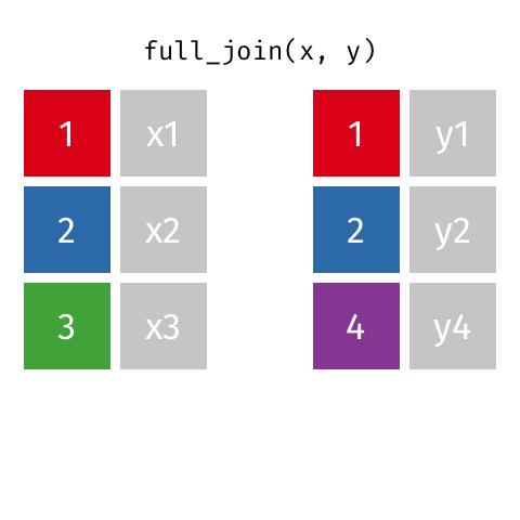
Full join
A full join of data frames x and y (full_join(x, y)) returns all rows from x and y. If there are any rows in x not in y (or visa-versa), the missing values are NA.
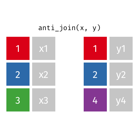
Anti join
This is often used to inspect which rows are unique to a data frame. An anti join of data frames x and y (anti_join(x, y)) returns the rows from data frame x that do not have matching values in data frame y. Only columns from x are returned.
Graphics with the ggplot2 package
R has the capability to make beautiful and versatile graphics using the package ggplot2 and its function ggplot(). Below is a brief overview of the use of ggplot(). There are too many aspects of ggplot() to cover here, so it is highly encouraged that you download and review this ggplot cheatsheet.
For further reading, see this data visualization tutorial and this gallery of visualizations and extensions for inspiration.
Core components
A ggplot() command is typically built using sub-commands linked by + symbols. The sub-commands are executed one-after-another to build the final plot. The core components to provide are:
- a data set - can be a standard data frame, or a spatial shapefile
- coordinate system - the x and y axes reflect the range of values within specified variables
- geom - the geometric marks to visualize the data (e.g. points, lines, polygons, etc)
- aesthetics - linking attributes such as color and size of geoms to variables in the data set
The first command ggplot() creates an empty coordinate system to which layers of visualization and nuance are added.
- Its first argument specifies the data set to use.
- Its
aes()argument establishes the variables to be mapped to the x and y axes.
Secondly, the geom is specified, indicating whether the data should be displayed as points, lines, bars, a map, etc. Without a geom, the data will not be visualized and the coordinate plane will be empty.
Other optional sub-commands can address the scales (e.g scale_fill_brewer() chooses a scale for the fill aesthetic based on the Color Brewer 2 color scales), labels (e.g. labs(title = "Attack Rate by Region") to define a specific title for the plot), themes (e.g. theme(text = element_text(size = 18)) makes all the text in the plot be a minimum size of 18 points), etc.
A command beginning with ggplot() will print the visualization but not save it. Using the assignment operator <- in the first line will assign the visualization to an R object and save it for later use. Print it by running a command of just the object name.
Geospatial mapping
In the “Place” section of the template, ggplot() is used to create geospatial maps of attack rates and other indicators.
In these cases, the coordinate system reflects latitude/longitude, and geom_sf() displays the spatial tiles of the regions contained in the map.
Aesthetic themes and labels
In the outbreak templates, detailed aesthetics parameters are managed by creating “theme” objects that can be referenced multiple in multiple ggplot() commands.
Below, the object epicurve_theme is assigned certain superficial plot parameters that are not associated with the data such as x-axis text angle, absence of legend title, and grid-line color. This object is then referenced in ggplot() commands throughout the template.
# this sets the theme in ggplot for epicurves
epicurve_theme <- theme(
  axis.text.x = element_text(angle = 45, hjust = 1, vjust = 1),
  legend.title = element_blank(),
  panel.grid.major.x = element_line(color = "grey60", linetype = 3),
  panel.grid.major.y = element_line(color = "grey60", linetype = 3)
)
Likewise, this chunk establishes the settings for the labels in epidemic curve graphics. The settings for x-axis and y-axis labels, title, and subtitle are stored in the epicurve_labels object, which is referenced in several epidemic curve ggplot() commands.
# This sets the labels in ggplot for the epicurves
epicurve_labels <- labs(x = "Calendar week",
                        y = "Cases (n)",
                        title = "Cases by week of onset",
                        subtitle = str_glue("Source: MSF data from {reporting_week}")
                       )
For loop
A for loop is used to repeat or iterate code, making repetitive tasks more efficient. The “loop” repeats a series of commands, altering them slightly to account for different input values that are stored in a vector. This vector, or sequence of values, can be the values within a data frame variable.
In the outbreak templates, a for loop is used at the end of the Place analyses to create bar graphs and maps of regional attack rates for each epidemiological week.
The basic structure of a for loop is as follows:
- Setup, including :
- The keyword
for(note the lowercase)
- Parentheses containing:
- A placeholder term (e.g. “i”, “value”, or another relevant short word)
- The keyword
in
- The name of the vector to loop through
- A placeholder term (e.g. “i”, “value”, or another relevant short word)
- Opening bracket
{
- The keyword
- Actions and commands to be performed for each item in the vector
- If the item is referenced in any command, use the placeholder term instead.
- Closing - A closing bracket
}
A basic example for loop is below. number_list is defined as a vector of four numbers. The for loop is set-up to examine each item (“i”) in number_list. The only command in the for loop is to print the value of “i” plus 2. Finally, the brackets are closed. As the loop executes, it produces one output for each item in number_list.
number_list <- c(102, 53, 14, 88)

for (i in number_list) {
  print(i + 2)
}## [1] 104
## [1] 55
## [1] 16
## [1] 90In the outbreak templates, the for loop is more complex than the simple example above, but follows the same basic structure.
The loop is set-up for each item “i” of all the unique values in the variable epiweek within the data frame cases. This vector is a list of the epidemiological weeks with no repeated values. If you want to see this vector of epidemiological weeks, highlight and run just unique(cases$epiweek).
Numerous commands are located within the loop’s brackets { }, but the most important is the first: this_ar <- filter(ar, epiweek == i). This command restricts the large data frame ar to only the epiweek currently under consideration by the for loop. Thus, the data frame this_ar will be different for each iteration of the for loop . All the subsequent steps (producing a map and a barplot) are performed on this filtered dataset.
The final step creates a combined plot of the map and barplot for the current epiweek “i” using the plot_grid() function from the cowplot package. This plot is aligned horizontally based on the top and bottom of each plot. After producing the combined plot, the loop advances “i” to the next epiweek item in the vector, repeats all the commands in the brackets { }, and produces a new combined plot.
# go through each epiweek, fiter and plot the data
for (i in unique(cases$epiweek)) {
this_ar <- filter(ar, epiweek == i)
# map
mapsub <- left_join(map, this_ar, by = c("name" = "Region"))
# choropleth
map_plot <- ggplot() +
geom_sf(data = mapsub, aes(fill = categories), col = "grey50") + # shapefile as polygon
coord_sf(datum = NA) + # needed to avoid gridlines being drawn
annotation_scale() + # add a scalebar
scale_fill_brewer(drop = FALSE,
palette = "OrRd",
name = "AR (per 10,000)") + # color the scale to be perceptually uniform (keep levels)
theme_void() # remove coordinates and axes
# plot with the region on the x axis sorted by increasing ar
# ar value on the y axis
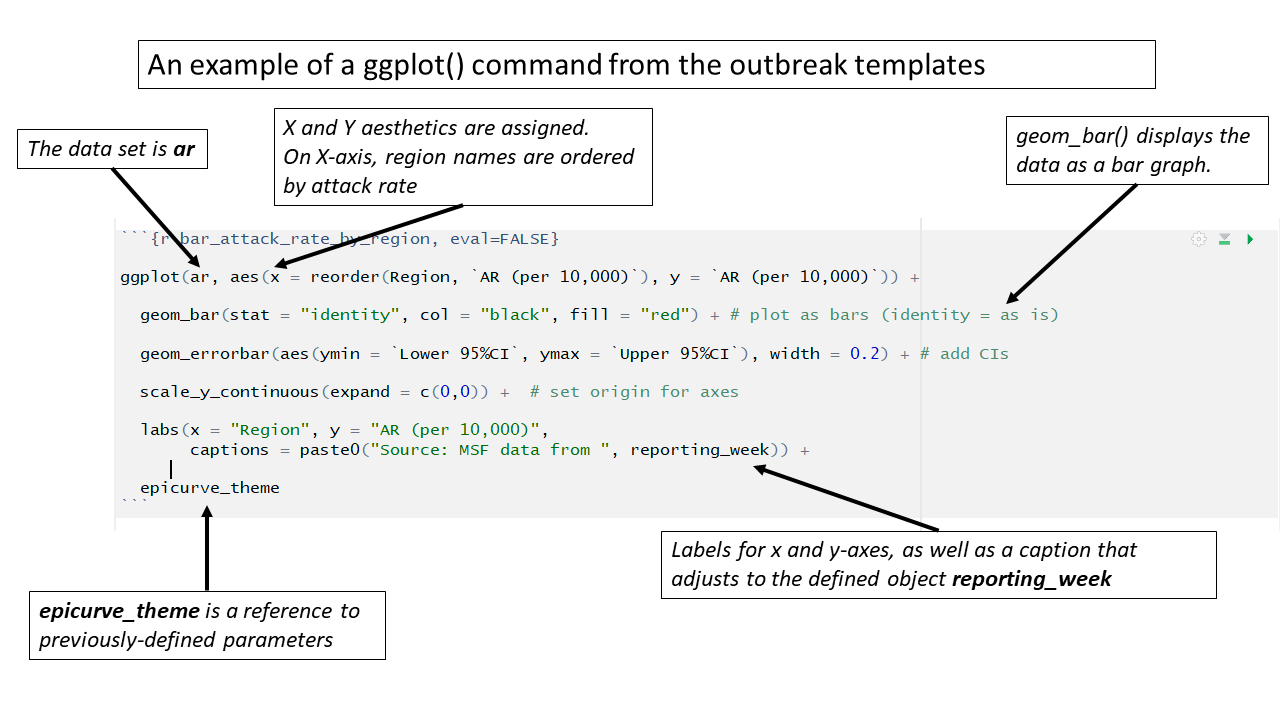
barplot <- ggplot(this_ar, aes(x = reorder(Region, `AR (per 10,000)`),
y = `AR (per 10,000)`)) +
geom_bar(stat = "identity", col = "black", fill = "red") + # plot as bars (identity = as is)
geom_errorbar(aes(ymin = `Lower 95%CI`, ymax = `Upper 95%CI`), width = 0.2) + # add CIs
scale_y_continuous(expand = c(0, 0), limits = c(0, max_ar)) + # set origin for axes
# add labels to axes and below chart
labs(x = "Region", y = "AR (per 10,000)",
captions = str_glue("Source: MSF data from {reporting_week}")) +
epicurve_theme
# combine the barplot and map plot into one
print(
cowplot::plot_grid(
barplot + labs(title = str_glue("Epiweek: {i}")),
map_plot,
nrow = 1,
align = "h",
axis = "tb"
)
)
}Here you can read more about for loops and iteration in R.